Straight to Checkout: Are your merchandising and displays costing you sales?
Apr 24, 2023Have you ever found yourself at check out and realized you missed half the store, and consequently a lot of what you thought about buying? What happened?!
Why were you unconsciously drawn toward the register? You likely found yourself paying and may have even felt like the shopping experience was rushed and transactional.
On the other hand, have you ever had a shopping experience where you found yourself exploring every area of the store space, and ended up with a couple of extra goodies in your shopping cart?
In this case, the retailer was effectively using their store as a sales tool.
Using your store as a sales tool
Superette is an example of a company that’s doing this masterfully.
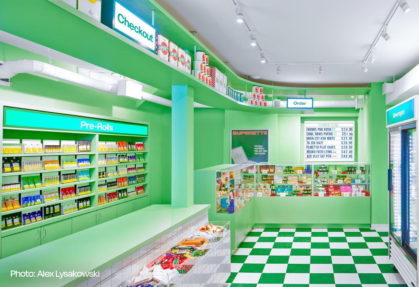
By offering a range of lifestyle products, Superette adds a layer of shopping that most cannabis stores omit. They offer open visual merchandising that encourages exploration and interaction with the team behind the counter.
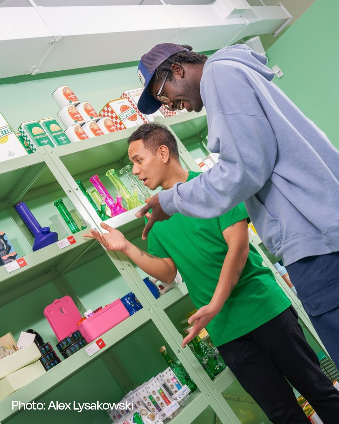
Plus, they’ve got an incredible impulse-buy area at the checkout to prompt add-ons. They use every inch of their stores strategically, and their teams expertly leverage the store itself as a sales tool.
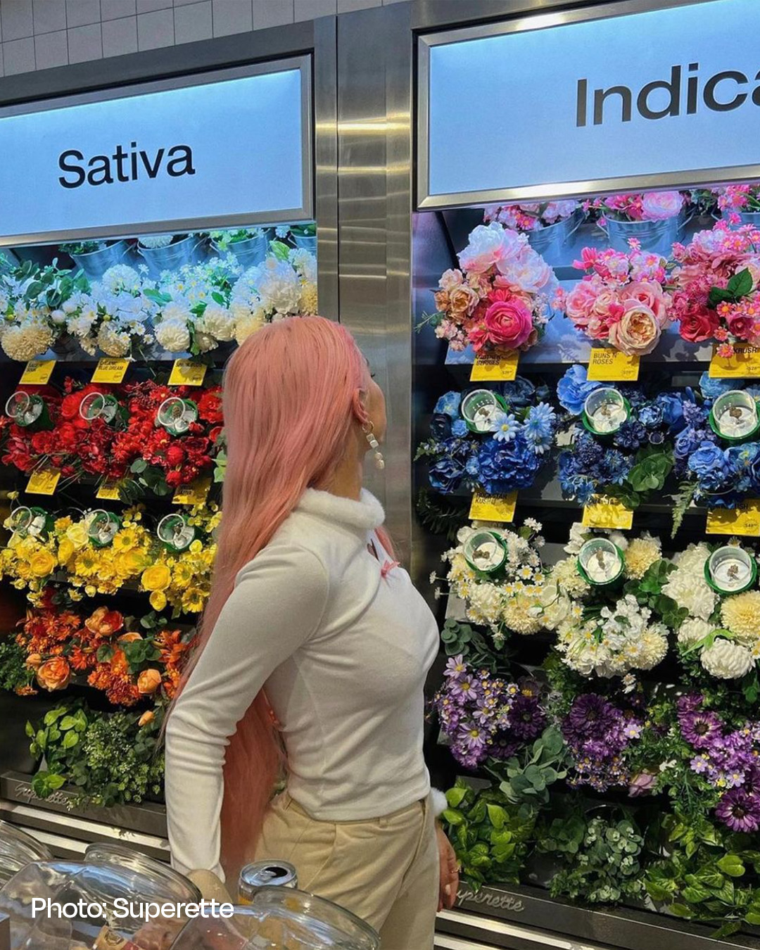
As you walk through their shop, you may realize you need more rolling papers. You might even pause at their "flower wall" for a photo opportunity and pick up a quirky and fun T-shirt to add to your wardrobe.
Superette has discovered a way to make shopping for cannabis an engaging and enjoyable experience.
Why were you unconsciously drawn toward the register?
You likely found yourself paying and may have even felt like the shopping experience was rushed and transactional.
For instance, consider grocery stores that create displays with every ingredient you need for taco night or clothing stores that construct entire outfits on a mannequin with the clothing within reach.
Let's build on the example of a clothing shop. Imagine a customer walks in looking for a pair of running shoes. The salesperson can suggest socks, which is one route. However, another option is to display the shoes next to socks and accessories or even as part of an entire outfit on a mannequin. We have all been in this situation, with a product in hand and a minute to spare to browse and pick up an extra item.
It is why Superette is fun! They build a story that reflects their brand, give subtle suggestions for pairing products, and very importantly, engage all the senses.

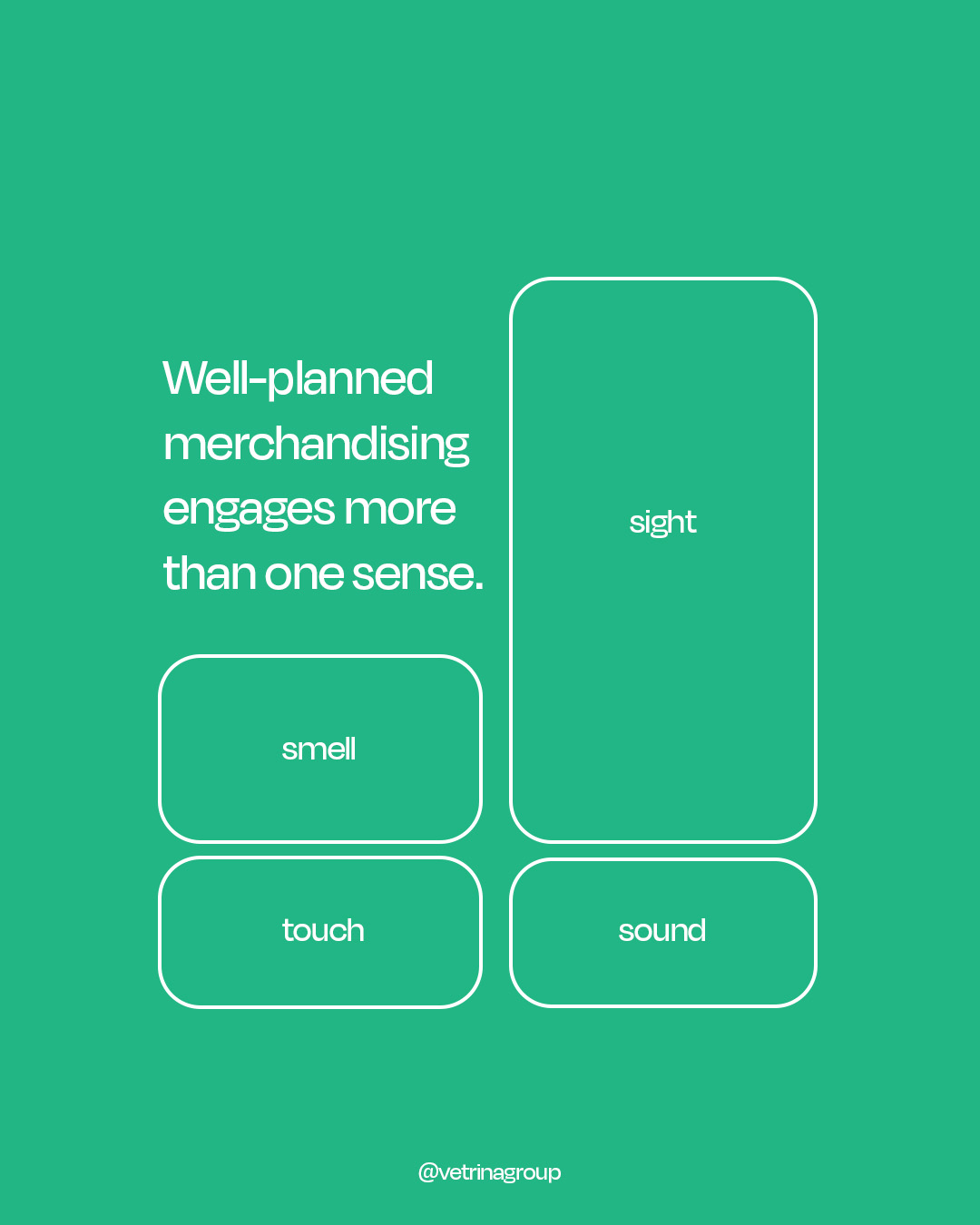
Well-planned merchandising engages more than one sense. By considering smell, touch, and even sound, like music, you can help customers make purchases more confidently. No one wants to walk into a quiet store as it immediately feels less welcoming.
Path-to-Purchase
Have you ever timed how long your average customer spends in your store? Or how often, on average, do they pause to touch a product?
If you notice that customers are moving quickly from the entrance to the cash register, you may miss touchpoints.
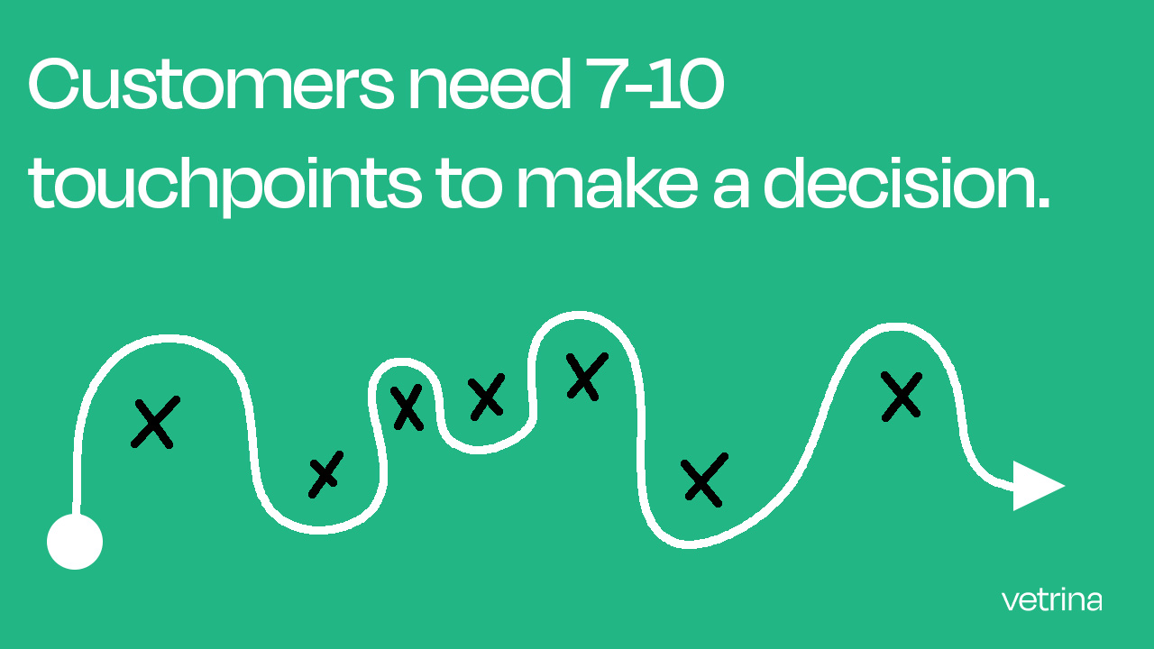
Customers typically need 7-10 touchpoints before making a decision. They must also be in the store long enough to explore everything you offer.
You want to give them opportunities to pause and explore, but that doesn't mean forcing them to wait. By creating opportunities for customers to think and engage with your brand and products, they may feel less rushed and more relaxed. This can lead to them asking extra questions about a product they've been thinking about or pausing to read about a new item you just brought in.
So, let them slow down and increase their touchpoints.
Displays
As a brand, you have a target audience, and displays are an opportunity to flex your knowledge of their needs. You are helping them find what they need and then showing them what they will want right next to it.
Create cross-category displays with complementary products. This will help drive attachment rates, but they must set the tone and speak to your target audience.
Use the ‘Rule of Three’ and create a product use story without clutter. Pair cross-category products that work together rather than compete. Such as placing raw flower, a bong, and a grinder next to each other.
Tactics to try so your customer doesn’t go straight to check-out:
Retailers:
- Avoid clutter/chaos in the store. This overwhelms customers with too many visual cues
- Analyze weekly sales to determine how displays impact your numbers. Keep things fresh, regular customers will ignore old displays
- Audit your stores for merchandising compliance. Assign merchandising management to team members, so there’s accountability
Brands:
- Ensure collateral and vanity packaging is modular and easily understood. This allows retailers to plug-and-play with their existing inventory
- Create a plan for multiple touchpoints within the in-store customer journey
- Offer retailers a visual display guide, so that they can meet your brand standards
Tactical insights to become
a Cannabis Retail Insider!
Access expert insights in one easy-to-digest
and follow-along newsletter.
We hate SPAM. We will never sell your information, for any reason.

